

Mission Web Platform
Redesign of various components of the United States embassy website template.
Project type: Large team | UX/UI Design + Research/Information Architecture
Project length: 11 months | 2020 - 2021
Tools: Adobe XD, Optimal Workshop, Usability Hub, Axure, Jira, Confluence, Agile, Wordpress, Google Suite
Overview
The United States Department of State needed an accessible redesign of its embassy website pages. Using a combination of user research and testing, stakeholder input from regular embassy meetings, and platform constraints, I assisted with:
Providing usability suggestions for website design through heuristic evaluation
Designing the Consular Services, Education & Culture, and American Spaces pages
Iterating map redesigns for the mobile homepage
Performing user testing for the information architecture of the template
1.
Heuristic Evaluation
Small section of the first iteration of design recommendations
The redesign of the Mission Web Platform had begun before I was onboarded as an intern by a team of UX researchers, interface designers, and stakeholder researchers. The first draft of the redesign was created to please a multitude of different stakeholders with different needs (such as embassies that were hesitant to include political documentation due to in-country tensions, and missions that had a multitude of consulate locations), and therefore was not optimized for the users. I performed a full evaluation of the website’s homepage in order to find problematic aspects of the design that were easier to see from a fresh point of view. I categorized issues and provided screenshots, provided suggestions on solving each issue, and quickly prototyped what a solution might look like.
I found (among others) -
Issues with spacing
Many of the spacing between various elements was inconsistent, and confusing. Some content was too closely spaced, making things that weren’t related seem connected, and in other cases, too far, making the user have to move their mouse a long distance to click.
Confusing content
The layout of the news articles on the top of the page was difficult to read, as a user, and optimized for the mission rather than local users trying to find consular information. I recommended moving the content so that it took up less space, and adding information about in-country services for the top of the page.
Unresponsive mobile design
The mobile version of the map was unresponsive, and the page spanned further than the width of a phone. Additionally, the map was difficult to user in a meaningful way on a mobile device.
Inconsistent branding
The fonts and colors used did not align in various locations. I advocated for a more consistent branding for the lease amount of user confusion.
Pop up search bar
When users clicked the search bar to explore the website, a pop up box appeared for the text input. I suggested this be removed as it interrupted the flow of the website experience.

2.
Designing Pages
I was tasked with designing the Consular Services, Education and Culture, and American Spaces pages using Adobe XD and Axure within an Agile product environment. In this process, I performed competitive analysis to ensure a smooth user flow that was modern, usable, and accessible. Additionally, I abided by both the branding that was previously created on other pages, as well as 508 compliance, digital governance policies, and federal style guides. I also utilized previous user research, such as personas, stakeholder interviews, and more.
Consular Services
The consular services page is one of the most important pages on an embassy website. It is visited by a huge variety of users, many of whom are not English speakers, do not have technical proficiency, and are looking for one service in particular. In addition to this, there are many users who are Americans abroad who are seeking time-sensitive emergency information. Therefore, the page needed to be usable to a wide audience, and extremely easy to navigate.
Old Visa Services Page
Old Visa Services page
Iteration 1
I started by tracing the home page using Adobe XD. I decided that having an in-page navigation bar was the easiest way for users to quickly find what they were looking for. A thin welcome bar preserved important space on the page, and an advertisement for the new search wizard (which was requested by stakeholders) took up minimal space. We organized the content in a way that put the most-utilized items first, and under-utilized items last.
To further conserve space, particularly for users who had a bad internet connection, I grouped content into sections, and ensured that users would be able to easily see a preview of each section. Additionally, each page had to be modular so that with any emergency notifications, content could be moved around at will. With each embassy location having different content needs, easy customizability was a priority.
Iteration 2
Iteration 2 was a higher fidelity wireframe than iteration 1, and included more routine services, open-source placeholder images, and design elements behind each section image. Additionally, the banner hero image and text was expanded to include informational text, and indicating lines were added next to each section.
Iteration 3
Iteration 3 took into account feedback from stakeholders, who wanted to include more bright and friendly colors on the site. The dark blue was changed to a (in style guide) teal.
Iteration 1
Iteration 2
Iteration 3

My final iteration

Live embassy website
Final Product
The image on the left is my final iteration. The image on the right is the live page that was implemented in the migration.
In my final iteration, I changed around colors to reduce the amount of yellow on the page, giving it a more relaxing and calming atmosphere.
The most challenging aspect of this project was designing for a wide audience of millions who all have different cultural norms about technology, different levels of access and knowledge of technology, and varying levels of urgency. Additionally, designing for up to 168 embassy websites who all needed to customize the site to their needs was a huge challenge that I believe I successfully accomplished through my design. The constraints of the style guide, use of Wordpress, and conflicting stakeholder input was also a challenge that I learned from in terms of working with difficult situations.
If I were to continue this project, I’d like to find a way to improve color contrast for accessibility, make the page more dynamic for constantly changing content, and improve the typography to build on the “modern” theme.
Education and Culture
Once the Consular Services page design was finalized, I was asked to design the Education and Culture page - focusing on international students who would like to study abroad or travel in America.
Though the audience for this page was more narrow than the consular services page (comprised of educated young students), I kept the design similar in order to maintain a consistent feel on the site. My design is below, next to the current version of the page.
My design
American Spaces
Finally, I was asked to design the American Spaces page. This page promotes virtual and in-person locations in-country that promote interaction in an American-themed environment. Its target audience is for those who want to study in America, are interested in learning American English, or simply those who are interested in the United States and its culture.
I created two versions showing two different types of expansions for the text. This was a challenging task, as ensuring that the movement of text during expansion did not confuse the user was a high priority. I decided that a vertical expansion would be the least intrusive method of achieving this, over both a pop-up or a horizontal expansion.
My three designs are below, above the current live website.
Iteration 1
Iteration 2
Iteration 3
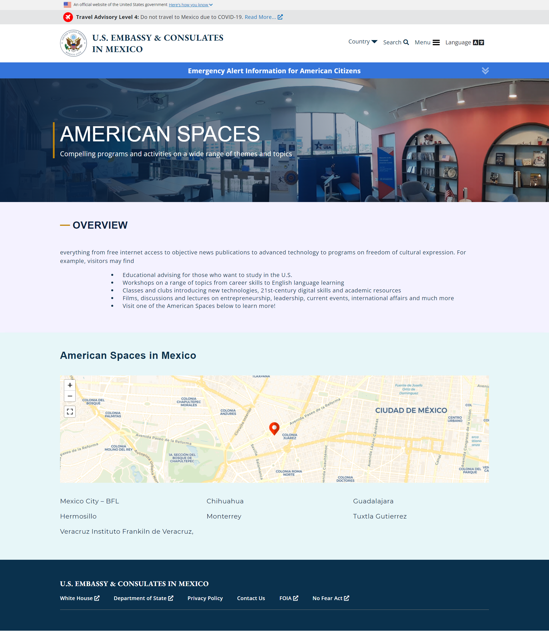
Live page
3.
Mobile Map Redesign
For the mobile version of the website, the maps showing embassy and consulate locations were not designed with the user in mind. They were hard to click, and the size was not conducive to operating a device with the hand, especially for users with smaller phones.
Original Mobile Map Prototype
Original mobile map
Original mobile map popup
With this in mind, I designed several wireframe options for a map interface using iteration.
My Mobile Map Prototypes
Iteration 1
Iteration 2
Iteration 3

Iteration 4
Iteration 5
Iteration 6
Iteration 6 map
Iteration 7
Iteration 7 map
Ultimately, we decided that iteration 2 met the users’ needs best in terms of providing the most options for the user, reducing load time, and packing lots of information into a small space. I was then asked to update the design, and the final iterations are below.
Final Prototype
Iteration 2 - updated
Iteration 2 - updated map popup
Current Live Mobile Map
4.
Information Architecture User Testing
The organization of the new Mission Web Platform was one of the main motivators behind the redesign. Users could not easily find the services they were looking for, and the taxonomy behind the main menu was not well thought out. Stakeholders were concerned about the use of a hamburger menu on the desktop website, and expressed concern about visibility of services compared to public diplomacy content (news, articles, etc.).
“Where is the consular information on this model? I don’t see how I can get a visa".” - FSO, Tokyo
“Right now this layout is shifting heavily towards temporary PD (public diplomacy) tools and there’s no offset to the lack of visibility to routine and emergency services information.” - Consular Affairs, Overseas Citizen Services
To offset this concern and ensure that users could quickly find what they were looking for, I performed several usability tests on the new menu categorization that were disseminated via the official U.S. Department of State Facebook page, and had 627 participants.
Ideation
Before we begun, I had to ensure that the current menu item titles were as clear and explanatory as possible. I had several discussions with my supervisors and stakeholders about the best wording, phrasing, and word case to use.
Testing
I created two usability tests, one card sorting test on Optimal Workshop, the other a first click test on Usability Hub. The card sorting test was the only one that was able to be completed in the time given.
In this card sorting test, users needed to group 12 government terms into related groups and name each group based on how they were related. The hope was that we would find the best way to categorize services into more general main menu items.
I created a pre-test survey to determine the location and native language of each participant. This was important because we needed to ensure that the final groupings were obvious only to native English speakers, but non-native English speakers as well. Additionally, we needed to ensure that the verbiage used was not too jargon-y.
Examples of the test
Results
Participant overview
Optimal Sort analysis tool
An example of similar group labels from two participants
Interpreting the results
Because there were participants worldwide, many answers had misspellings. I manually went through each answer, and grouped similar categories. In the end, I uncovered that the phrase “passport renewals” was unclear to foreign users, and seemed to be interpreted often as a service for non-citizens. Users were also unfamiliar with the term “notarization”. I recommended that the passport renewal and notarization pages be hidden under a submenu that only citizens would be likely to click in order to reduce confusion.
An analysis of the background of participants as well as common grouping patterns
A list of important takeaways and most interesting or helpful categories
5.
Results
In 2021, the State Department launched 20 redesigned U.S. embassy and diplomatic mission websites, which included improvements to user experience and information accessibility. In the first quarter of 2022, 17 of the 20 sites received 20 million pageviews -- a 12% increase from the previous quarter.
6.
Final Thoughts
I also reviewed policy pages on state.gov and provided recommendations in a government presentation for SEO and content, performed content migration for 23 embassies and consulates to the new Mission Web Platform through Wordpress, assisted with drafting sections of a report required for acquisition of tools needed for the new Mission Web Platform including surveys for customer feedback, learning management systems, and chatbots for FAQ, helped with the onboarding process of the new MWP websites, including content migration and training document creation, and attended regular meetings and Agile sprints with the department, stakeholders including the Biden Transition team and foreign service officers worldwide.
This internship was a challenging yet fulfilling experience. Working with and for an audience of millions of users from different cultural, technical, and linguistic backgrounds to ensure that the digital content was universally accessible was incredibly rewarding. The website is currently finalizing its migration process, and soon most embassy websites will be featuring my designs and input.