
Pluto TV
Pluto TV

Summer lean UX internship on a quickly-growing and innovative team with a free and ad-based streaming platform.
Project type: Large team | UX/UI/Product Design + UX/IA Research
Project length: 10 weeks | 2022
Tools: Figma, usertesting.com, Figjam, Jira, Confluence, Zeroheight, Google Suite
Overview
At this internship, I focused on designing user research studies that provided me access to users’ behaviors and traits in their use of Pluto TV’s navigation, information-finding, and sign up process.
From these studies, I was able to condense a large amount of information in order to provide recommendations for CTV interface updates, feature changes, architecture restructuring, accessibility issues, and persona jobs-to-be-done.
Goals
Internship project outcomes had to align with overhauling business Q3 goals, decided on as my internship began.
Improve Engagement Actions
Make engagement actions more discoverable, frictionless, valuable, and appealing through design so we can present users with content they like, particularly of bookmarking actions.
Improve content discovery on both Live TV and VOD features to increase engagement actions by 50%.
Increase Total TVMs
Present content optimized to retain users and increase session length through well designed experiences.
Create well a well designed system for users on new and novel devices, like Android automotive.
Reduce Session Bounce Rate
Reduce session bounce rate across O&O platforms by 10%
Increase User Registration to 10%
Improve the value of a signed-in experience though new designs and features, and better communicate the value of this experience.
Augment and streamline the user sign up process to maximize the registration completion rate.
Rework the Design System
Rework the design system so that we have a clear organization of branding documents, Figma components, supplementary user research findings, and Atlassian resources easily at hand, particularly for product research in new markets.
Personas and User Journey
Creating primary user personas using qualitative and quantitative user interview data.
Testing Goals
In assisting with question ideation for our 11 in-depth user interview sessions, I considered broader business goals in tandem with smaller design goals.
We observed that user retention, as well as session length and depth was low. We wanted to understand how the app’s opening screen affected the instant gratification of users and their ability to find content they like within 5 clicks, as well as users’ method of launching Pluto TV, and how this affects brand trust. We also wanted to understand users’ barriers with using the Live TV guide, and if it was overwhelming to them.
We observed that engagement feature usage was low. We wanted to understand if feature buttons in the video player controls were intuitive and/or commonly used so that we could improve access to features like “watch from start” and know if we needed an onboarding feature to show users what features they can access. We also wanted to know if new users were confused to land in a Live TV player rather than a traditional VOD browsing page.
We observed that the user sign up rate has been low since launch, which affects our CRM to pull users back into the platform. We wanted to understand better entry points and interfaces for the process of signing up, as well as users’ expected value and barriers to signing up, including personalization questions and profiles.
I also wanted to capture information that would allow me to better align with customer segmentations to create personas that would align Pluto TV’s goals for years to come.
Users’ TV watching routine, needs and behavior
Their frustrations
Household environment
Household members
Jobs to be done
Traits and motivations
Streaming services used
General demographics
Ideation Workshop
It was important that we held a workshop to ideate on what personality quirks, traits, and motivations related to streaming might be relevant to our user personas.

Affinity Wall
With over 13 hours of interviews, there were a large number of notes to condense into findings.
In order to organize the information accurately and comprehensively, I created several affinity walls and content sorting methods on Figjam.

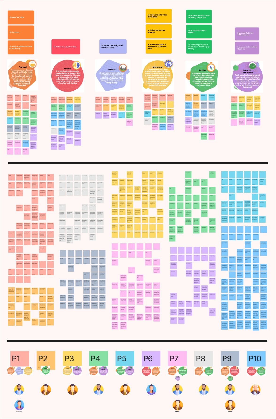

Personas needed to align with previously-found consumer need-states and persona categories.

Final Personas + Journey
The final result was four fully-filled in personas which utilized the jobs-to-be-done method, and accurately represented our user base and their needs.
I also created a user journey map to show each persona’s pathway.


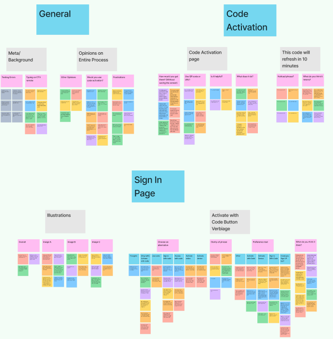
User Testing
Unmoderated user tests that give insight into various areas of improvement.
Content “More Details”
Code Activation
Global Navigation
“More Details" testing
Overview
I noticed in analytics that users were not interacting with the platform in ways that we expected, often ignoring clicks to add content to a playlist or view more of a description. In order to incentivize impactful interactions that would engage users to Pluto TV, I wanted to investigate potential pain points for the content expansion button and had the following testing goals:
Understanding if users could intuitively understand how to navigate to the full media description
Understanding how users navigate back to the main media menu
Knowing whether the “Watch Now” and “Back” button on the More Details view is confusing for users
I conducted an unmoderated usability test with 6 participants (3 users and 3 not) to see if users could perform the action of viewing more details, understand their expectations of what this button would do, and more, using a simulated CTV remote. In order to ensure this study was a priority, I performed a pilot test and modified the test accordingly to make it as clear as possible.
The results we found were highly impactful, and my presentation of the findings and recommendations led to a redesign of the more details button on the Roku platform. I found through analysis that the current order of button placement was confusing to users, and was able to present recommendations to stakeholders for a more impactful way of structuring this page.
Testing Errors
Testing Goals

Findings

Findings
Recommendations
Restructuring Screens
I recommended including more valuable information on the More Details page, or removing the Now Playing badge on the Episode Selection page in order to create space for a full description, reducing clicks for users.
I recommended allowing users to add the content to their “watch later” list on the More Details page in addition to on the Episode Selection.
More Details Button Name and Placement
Because the majority of participants selected “View Full Description” as the best name for this button, I recommended changing this button’s name to this ONLY if no additional information was be added to the More Details page.
No matter the format of the More Details page, I recommended moving the “More Details” button to be as close as possible to the truncated description.
New Layout
More detailed episode organization as well as horizontal buttons should be implemented into an updated design. Confusion about the More Details button location being so vertically far down the screen pointed to a need for a horizontal button layout.

Analysis and Synthesis


Testing Images


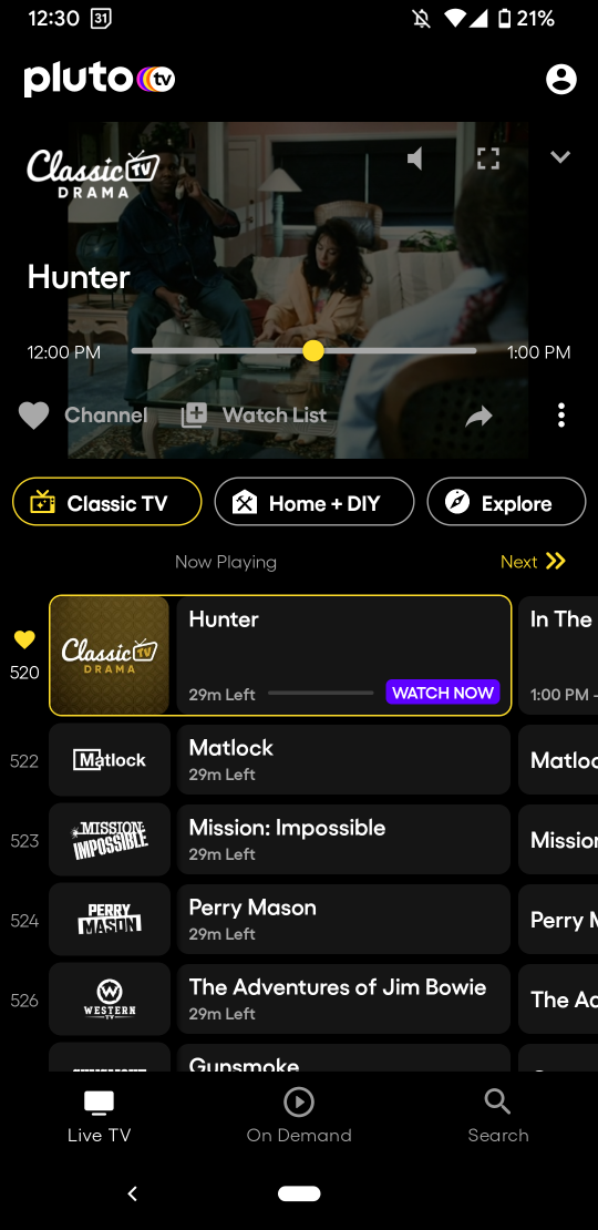
Code Activation testing
Overview
Pluto TV was trying to implement a new, easier method of sign up and log in, using code activation. I performed a user test to inform the implementation process with the goal of:
Seeing if users could intuitively know how to navigate to code activation from the main settings menu
Understanding what the clearest copy was for code activation to reduce clicks and frustration
Discovering if code activation was actually a useful feature for users and if they were aware of the benefit
I conducted an unmoderated usability test with 6 participants who regularly stream media on a CTV (3 users and 3 not) on the manage account and sign in pages. Tasks included attempting to sign in without using the simulated CTV remote, A/B testing of copy and icon preferences, and seeing if users found typing on a CTV keyboard difficult.
The results we found were highly impactful, and my presentation of the findings and recommendations informed the copy selection for the new code activation feature. Further analysis clarified that users did intuitively know what code activation is and how to use it, and were happy with the current copy of the button to access the Code Activation screen. It also identified small pain points with the layout and structure of this process.
Findings

Recommendations
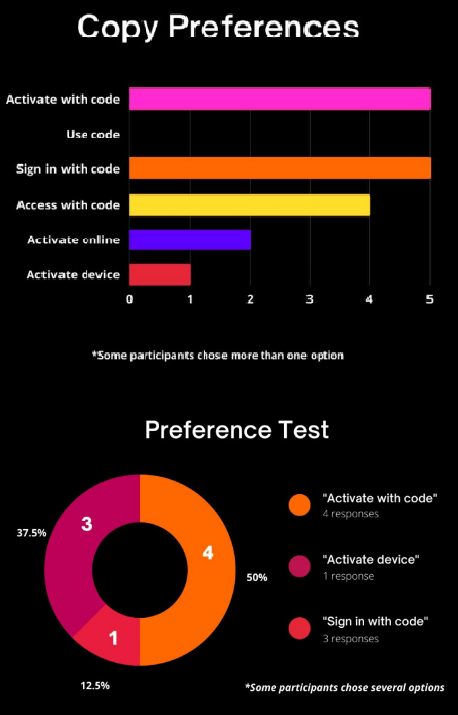
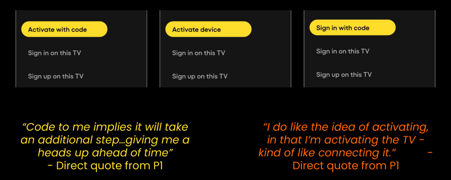
Change Various Copy
I recommended changing the copy of “Sign up/in on TV” to increase clarity.
Several participants suggested that they liked the verbiage “Sign in with code” better than “Activate with code” specifically due to its similarity to “Sign in on TV” and “Sign up on TV”.
However, these participants also agreed that “Sign in with code” did not effectively communicate that users could also sign up.
Several users, while reading through buttons, spent a few seconds differentiating between “sign in” and “sign up”, pointing to the fact that the difference is not immediately apparent.
I also recommended further testing to understand which users understand “access” and which understand “activate” using large scale A/B testing. In addition, I recommended avoiding the word “device” in copy while referring to a specific device as most participants found “device” for non-TV devices to be unclear, misleading, or too technical.
Clarify Illustrations
The “Activate with Code” visual could be clearer to improve button understanding as participants valued the illustration’s helpfulness, but could be improved in clarity. I suggested various visual replacements.
I also recommended moving the QR code to the left side of the Code Activation screen as the majority of participants selected to use the QR code over the URL.

Analysis and Synthesis

Testing Images


Testing Errors

Global Navigation testing
Overview
When reviewing the results of the code activation test, I noticed that users were potentially having difficulty understanding how to find key features in the main menu. I performed a user test to inform the navigation menu order with the goals of:
See if users can quickly find key features on the main menu, including the side menu and top (Live TV vs. On Demand) menu
Understanding where users assume the search, settings, and profile features to be located in the menu
Investigate if users understand where they are currently located in the system
See where users expect to land when they open the app
I conducted an unmoderated usability test with 6 participants who regularly used Pluto TV on a CTV. Tasks included answering questions about menu verbiage and expectations as well as navigation flow, an A/B test to name and organize menu items in order of importance, and a card sorting test to group and rank menu items based on similarity.
Results
The results I found were highly impactful, and this test was passed on after my internship ended to inform the new global navigation menu architecture and verbiage.
We found that most participants grouped Sign Up, Settings, and Kids Mode together, and Channel Guide, Now Watching, Home, Search, and On Demand together. Therefore, I recommended seperating these two types of menu item in the final global navigation menu.

Testing Images


