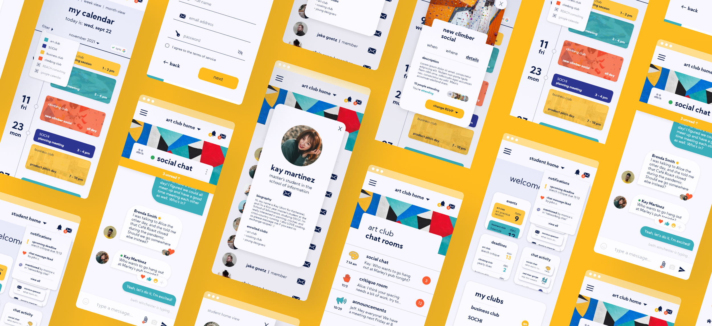
SynCampus is a mobile app for students to connect with and organize information from clubs and organizations on campus.
In this project, I performed user and problem space research to narrow in on a need that was not being fulfilled in the University of Michigan club space.
I found student difficulties in communication and organization, and wireframed, prototyped, and branded a club communications app named “SynCampus”.
-
Project Type
Solo | UX/UI Research + Design
-
Project Length
3 months | Fall 2021
-
Tools
Adobe XD, Figma, Miro, Google Suite
The Background.
Clubs and student organizations are an integral part of university life, both for graduate and undergraduate students.
They provide opportunities to connect and network with like-minded students who share similar interests and goals.
They facilitate a stronger connection between students and their schools, and both increase engagement and decrease likelihood of a school drop out.
They greatly supplement applications to graduate schools or job positions as they show a student’s personality outside of academics.
The Problem.
How might we create a platform for students to better connect with their extracurricular organizations in a way that flows with their normal daily habits?
Lack of organizational structure
Club platform decentralization
Lack of communication options
In approaching this project, I noticed that there are fundamental issues with the ways that clubs and organizations use technology to communicate with their members. With clubs being technologically decentralized, members find it difficult to keep track of club information and communications.
In 7 exploratory interviews, I found that student organizations varied greatly in the platforms they used. This problem is fundamentally a result of the failure of the University of Michigan to consider club activities as requiring organizational structure at the level of courses.
The Solution.
The solution is a centralized and social app that integrates with students’ personal calendars, and contains features for viewing club information and communicating with members.
Settings: Used while in a school environment, whether in campus buildings, dormitories, or a student user’s home.
Time: Used for short periods of time throughout the day, either to check on a notification or to plan the student user’s week.
Users: Multiple users on the app that the student user is highly likely to interact with.
Other products: Interaction with the university’s secure login system: Duo, as well as Google Calendar to sync schedules.
The Design Goals.
Accessibility was a main design goal - with a diverse student population, all users must be able to use the system with equal ease. This was achieved through font choice, high contrast, and easy navigation.
Indication of where in the system a user is located is also incredibly important. Modes are utilized to solve this complex problem of whether a user was in a particular club or their individual dashboard. Indicators are colors, background, and more.
Continuity was important so that the system’s flow was continuous and easy to navigate. Users must know where in the system they are located at all times.
The Research.
Solution + Feature Discovery
How can I implement this solution to best meet user needs?
In exploring the solution space, I considered previously existing components of a solution using competitive analysis to gather feature ideas and best practices, as well as to improve upon bad failed implementations.
I then used a QOC analysis to decide that the most usable solution was a new app for clubs to store information, communicate, and display events..
Iterative Sketching + Scenarios
My biggest lesson in this process is that if you think your idea is the best one, you’re wrong. I iterated on sketches in order to arrive at the correct solution for complex design problems.
From these final sketches, I created scenarios that helped me empathize with how users interact with the product.

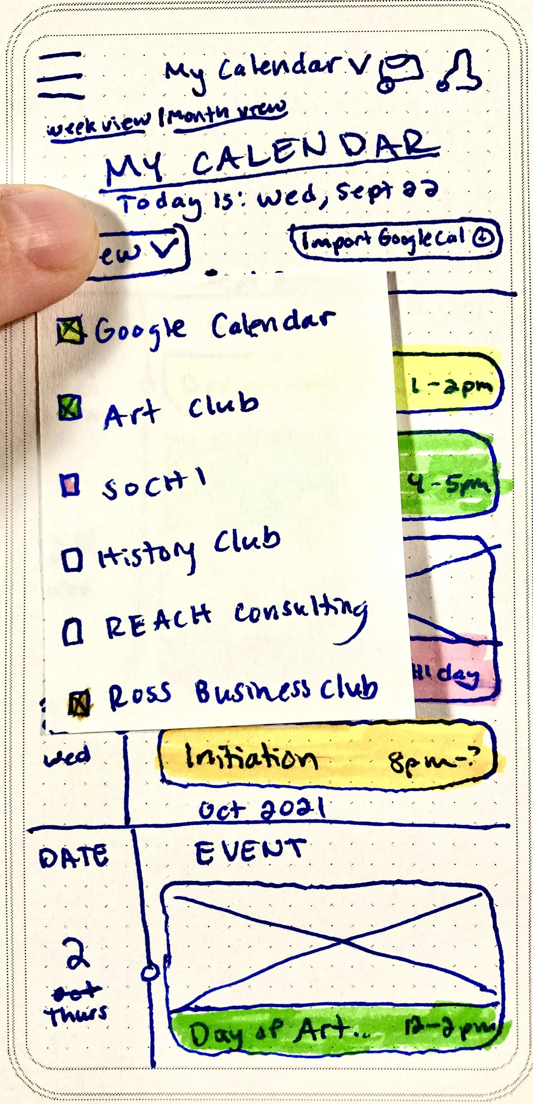
Final Calendar Choice
Final Event Choice
User Pathways
From these scenarios, I developed storyboards, story maps, and user flow diagrams in order to conceptualize user pathways through using the app.

Low-Fidelity Wireframes
From these scenarios, I was able to develop my initial paper wireframes.



The Methods.
Interviews + Personas
To find the needs of my users, I interviewed seven Michigan students active in campus organizations, asking questions such as…
Describe your needs in interacting with your club in a digital space?
Walk me through a time that you were frustrated with club communication.
What is your motivation for being a part of clubs?
I discovered…
Users need to communicate on-the-go
Users prefer email and calendars as their favorite organizational tools
Users need to be able to easily view and search past information
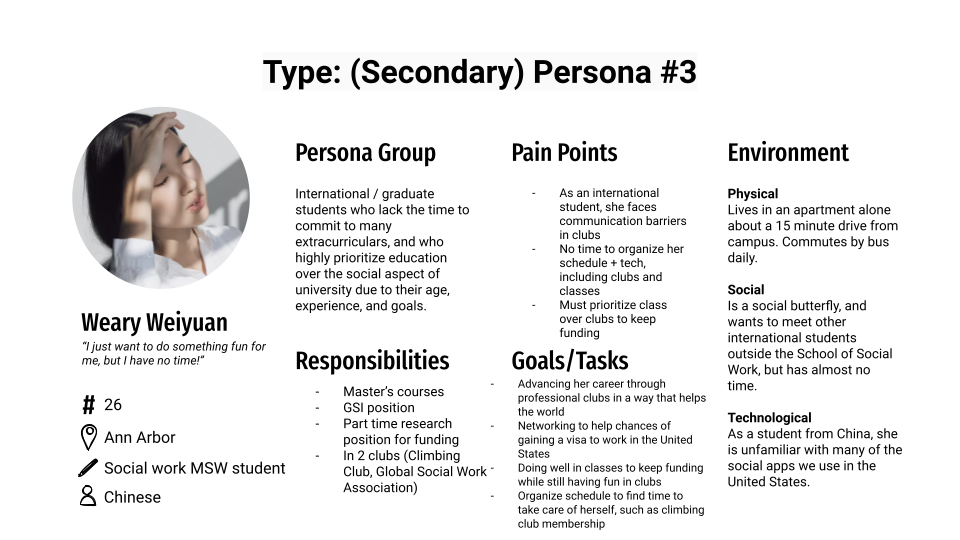
From these interviews, I was able to develop personas, which helped me to understand my users and their needs.
In particular, the anti-persona helped me to narrow down on what features the system does not need. From the anti-persona, I also developed an idea of a security system to prevent alumni from accessing club resources.
Branding
Branding the application was an important part of my design process. Choosing a color palette that represented both an educational space as well as one that created a friendly and approachable atmosphere was important to its success, but a challenge.
My final color palette is soft but energetic, educational but professional, and contains some colors tangential to the University of Michigan’s branding.
Naming the app was also important to its success. I iterated through three ideas, considering their recognizability, uniqueness (in terms of pre-existing applications and businesses), flow, and ensuring to use action words.
Keywords: campus, groups, organizations, connect, clubs, university, college, organize, sync, extracurricular,
Ideas: LinkedCampus, ClubSpace, Connective, YouCampus, NowConnect, Campusium, Connectio, Campus Bloom, CampusNext, SynCampus, Clubara, Engagify
From this list, I decided on SynCampus for its flow, branding capabilities, directness, and inclusivity of non-club extracurriculars.
Tagline: Connect with campus clubs
Web URL: syncampus (dot) com available (at the time of research)
App description: Connect with your campus organizations and clubs to organize your university experience and better sync with your group peers and extracurricular activities. Organize your event calendar, message peers, see announcements, and more!
Headline: SynCampus partners with Canvas to create a complete learning experience at the University of Michigan!

The Features.
Calendar Feature
There are two calendars on Syncampus:
A calendar for each club and its events.
A separate user calendar (displayed on the left) with events that a student has RSVP’d to, connected to their Google Calendar.


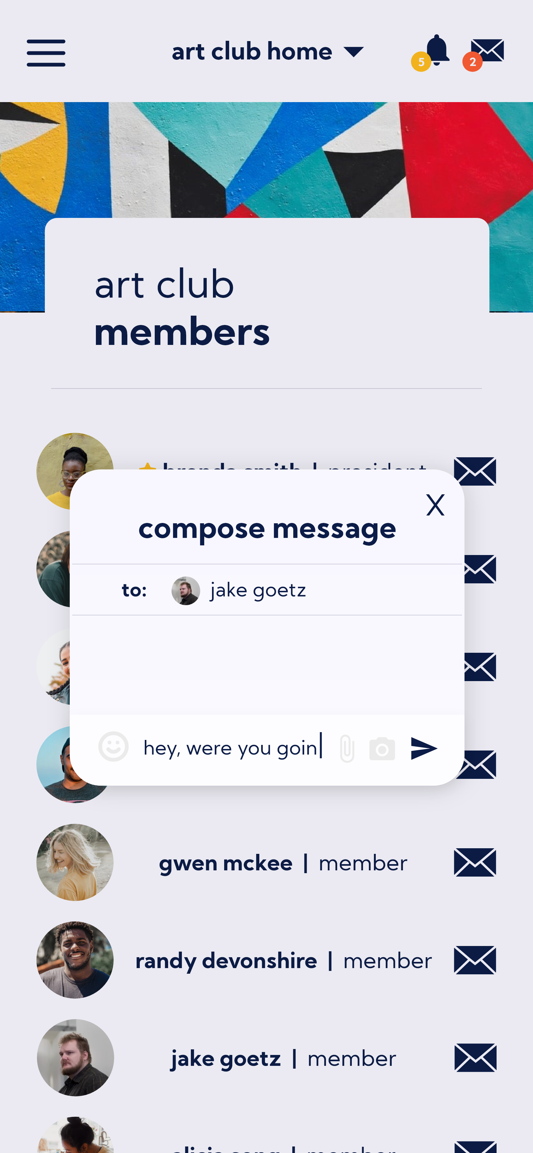
Messaging Feature
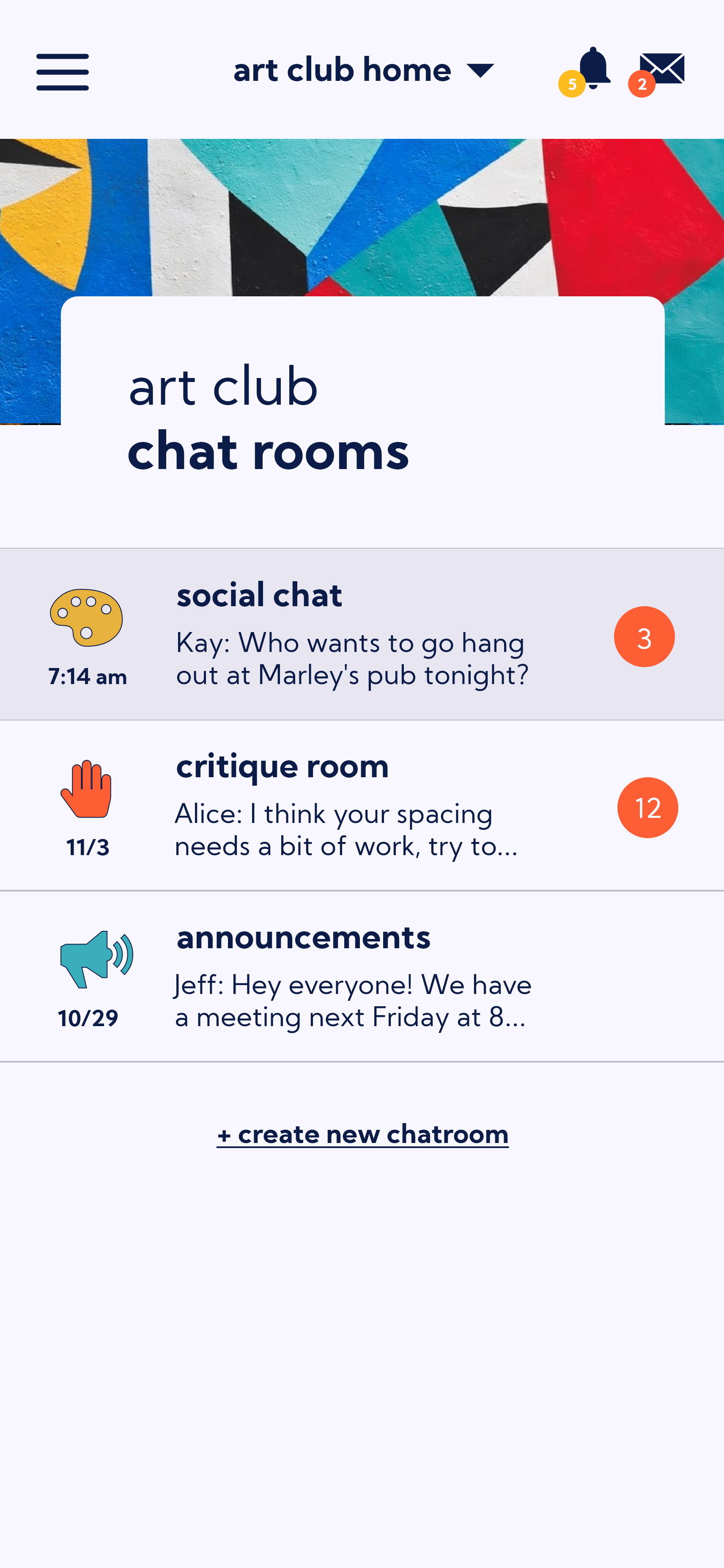
Themed chat channels in each club’s page (themes chosen by the club) (more than one channel reduces notification overload)
Direct messaging
There are no announcements, forums, or integrated email platforms.
Message notifications can be accessed both from the club navigation bar or the notification/message icons.
Best practices include an announcement-specific channel.

Dashboard Feature
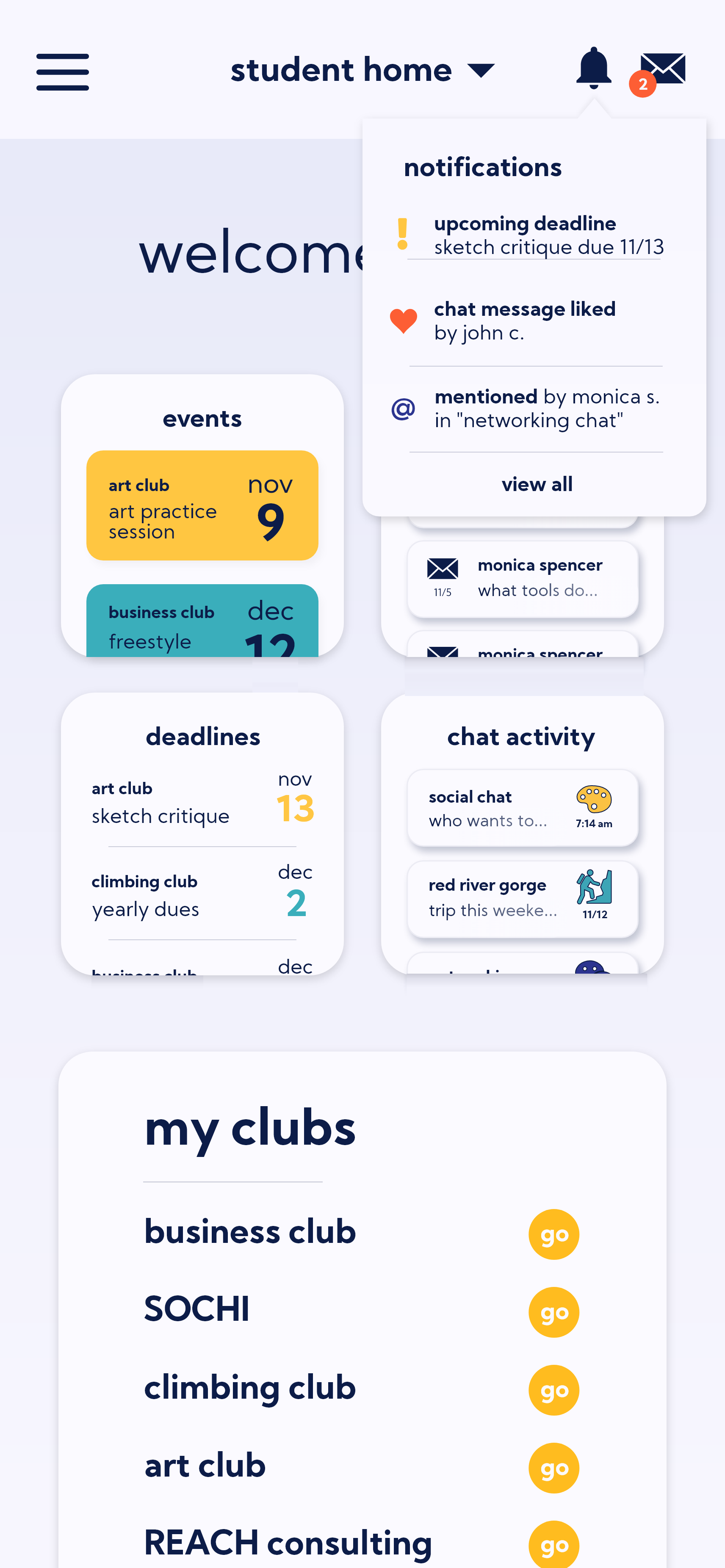
There are two dashboards on Syncampus.
A searchable user dashboard, with messages, upcoming events and assignments, and more from every club of which the user is a member.
Club-specific dashboards which include informational page, contact information, and descriptions. These clubs are customizable with “wallpapers” so that users intuitively know which club’s page they are currently accessing.
Club Dashboard
User Profiles Feature
User profiles with biographies, photos and information, as well as settings that allow them to choose whether or not to be personally contacted by others.
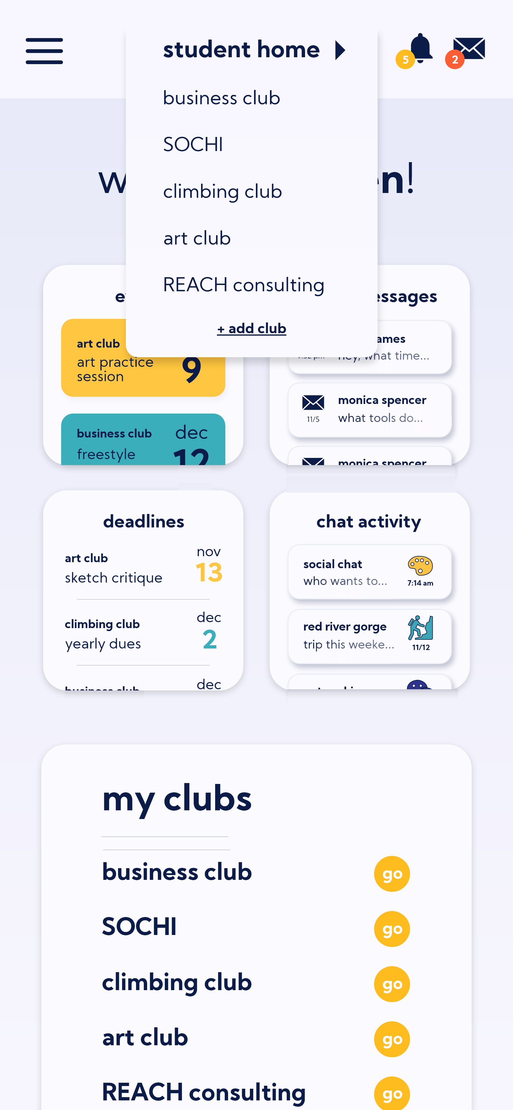
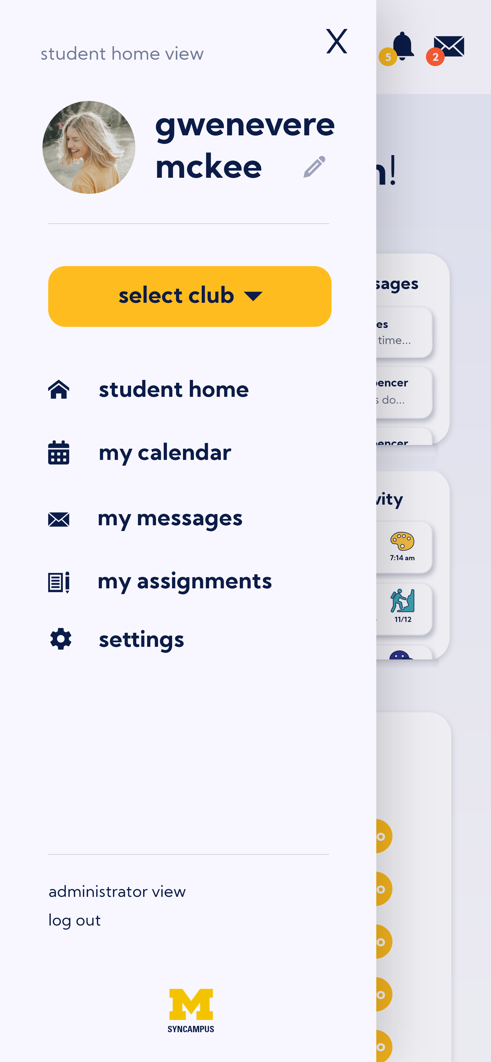


User Dashboard
Other features include…
A club drive, with media/documents/recordings/photo gallery.
A “people” list on each club’s page that provides a list of club members, and indicates which members are part of leadership.
Customizable club forms, used for things such as applications, merchandise sign-ups, potluck food registration, and more.
Integration with a payment system such as PayPal or venmo, for club dues and more.
A Zoom portal for each club, for online meetings.
A club assignments or reminders tabs, particularly used for clubs with project-based activities.
Duo authentication to restrict access to UM students only.
Push notifications for all types of features.
SynCampus provides a quick and easy way to keep track of club communications and organization. Student users save valuable time and brain power that could be better used in school work.

The Future.
Ethical Issues
Ethical impacts must be considered in every product’s development. There are several ethical issues that may arise from my design that must be mitigated.
With easier access in SynCampus, clubs may experience a rise in members which could lead to organizational restructuring or latent club members.
Club sponsors, who are often faculty or staff, would have more direct access to students and their private communications, lowering the academic boundaries between student and faculty. Security procedures and opt-out privacy settings should be implemented.
User Testing
User testing was incredibly important in the process of understanding how users navigate SynCampus, and I had three main findings from this process.
4 out of the 5 tested tasks had a 100% participant completion rate, with 87% of participants finding them easy to quickly complete.
One task - adding a new art club group chat - was difficult for participants, with 60% of participants unable to complete the task. From this finding, I created a plan to restructure how group messages are accessed, allowing access through the main messaging portal.
I discovered that users were not accessing club dashboards in the way that I expected. No users accessed clubs through the drop-down, and therefore I plan to better utilize this space with another feature.
What’s Next?
Features
A virtual meeting space would augment club capabilities post-COVID.
Adding a notification system for suggested events based on student interests would encourage attendance at forgotten events.
An embedded integration between Google Maps and the university’s bus system would make club meetings and content easier to access.
Testing
Although high-level need finding user research was conducted, I truly believe that systems should be created while iterating with user research to inform system structures. I’d like to conduct the following studies to iterate on my design.
Contextual inquiry - Watching students use the system in their natural environment.
Surveys - For a better feel for the mindset across students in terms of club experiences.
Usability tests - Comprehensive testing among diverse participants who are not my peers.
Administration
An administrator view for club leaders with standardized guidelines for page creation would prevent any best practice missteps.
Allowing users to opt-out of features that affect their privacy, such as being listed in member pages or being recommended events, is an essential option in the settings area.
The Takeaways.
Iteration
Design iteration is essential for breaking through obvious design answers. Complex design problems require many versions of the same solution to achieve the best solution.
Feedback
It’s easy to get stuck in a narrow-minded way of thinking if you do not listen to your users. Observing user testing sessions is a key part of designing for everyone.
Impact
In designing for social impact, design to solve a problem. Problems can grow and change over time, and by focusing on the changing problem, solutions will evolve as well.


